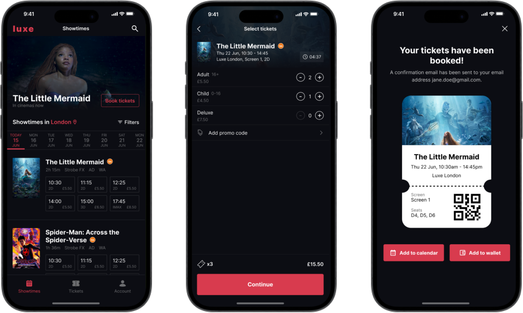
No more waiting in line, book with Luxe to save time
Overview
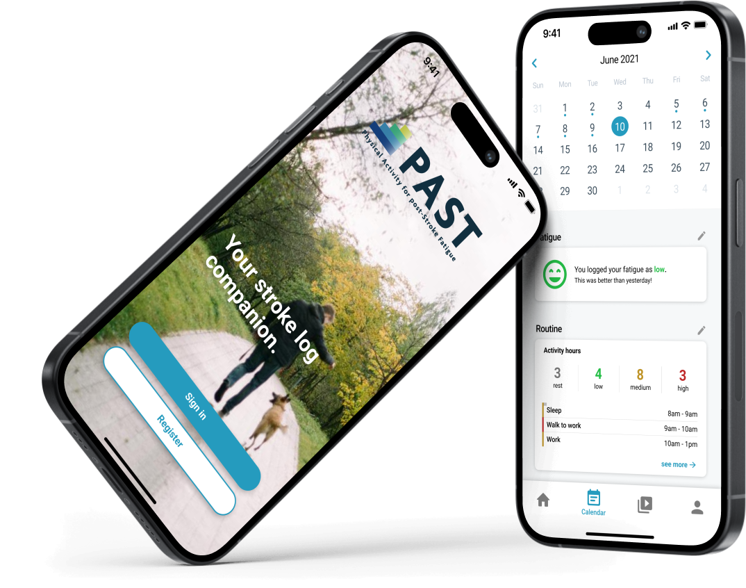
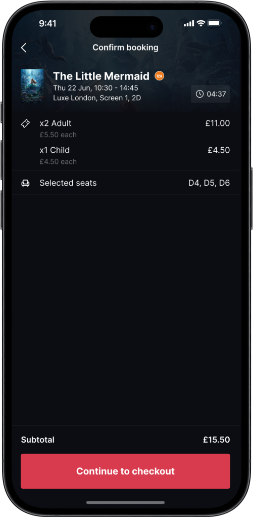
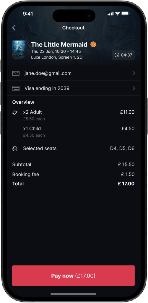
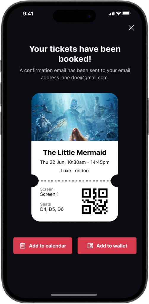
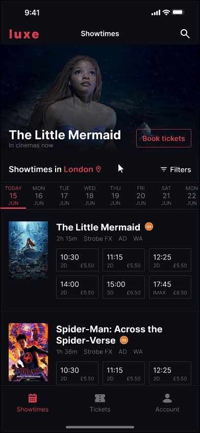
I decided to take the Google UX Design Course to learn more about industry-level standards and improve my design skills. For one of my projects, I designed a conceptual mobile app called Luxe that allows users to book movie tickets in advance and reserve seating. Using design thinking, I engaged with every aspect of the UX design process from user research to prototyping.
Understanding the user
As a first step, I interviewed five users who were frequent moviegoers, and gathered data about their experience purchasing cinema tickets. This user group confirmed initial assumptions in regards to users preferring faster options such as self-checkout, but the research also revealed other pain points:
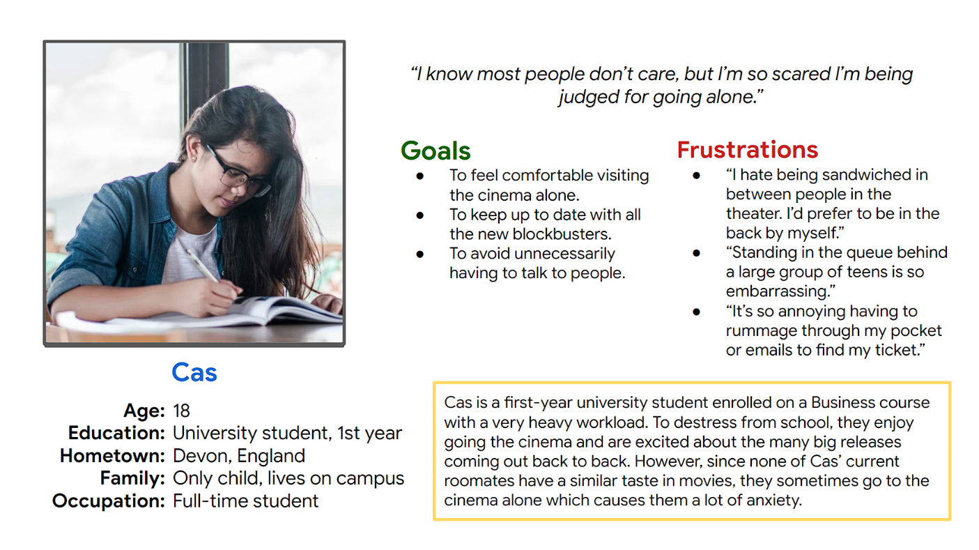
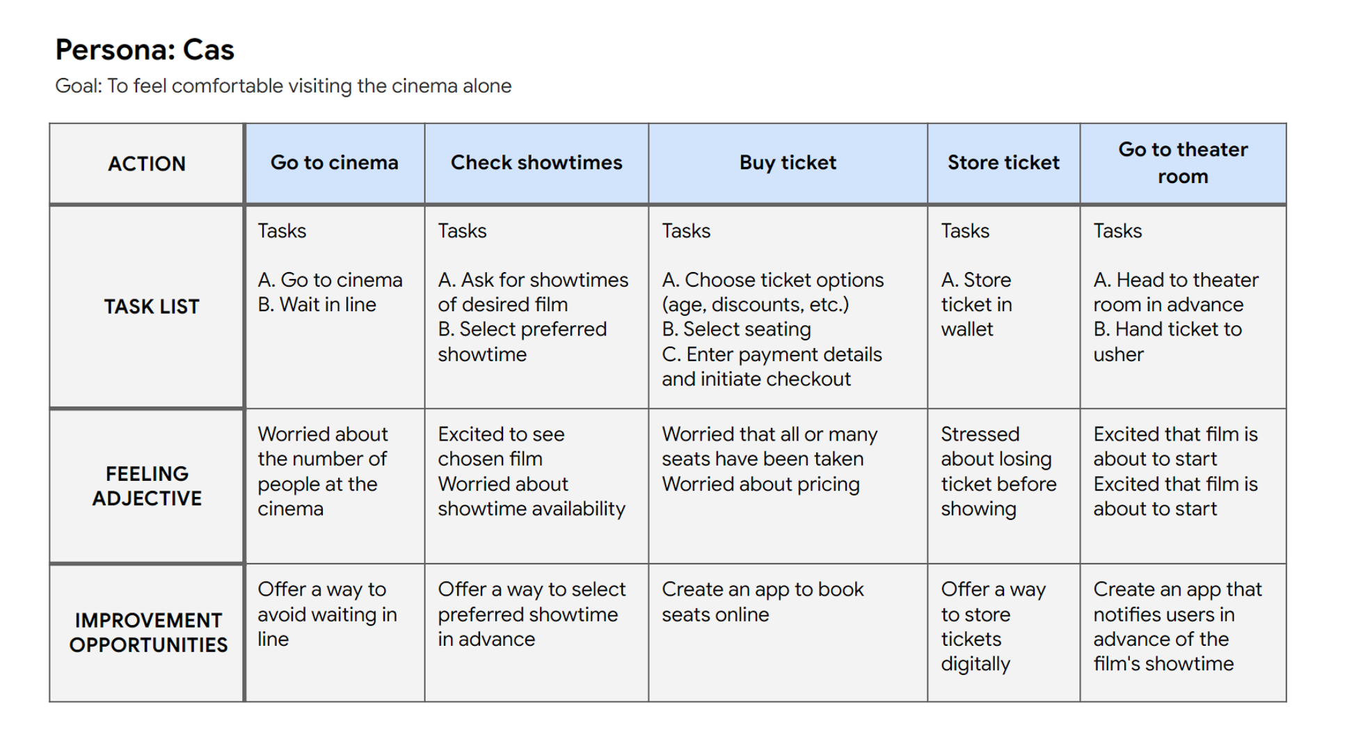
I then created a persona to simplify the research into one focused user which was referred to throughout the entire project to ensure the user remained the focus of any design decisions made.
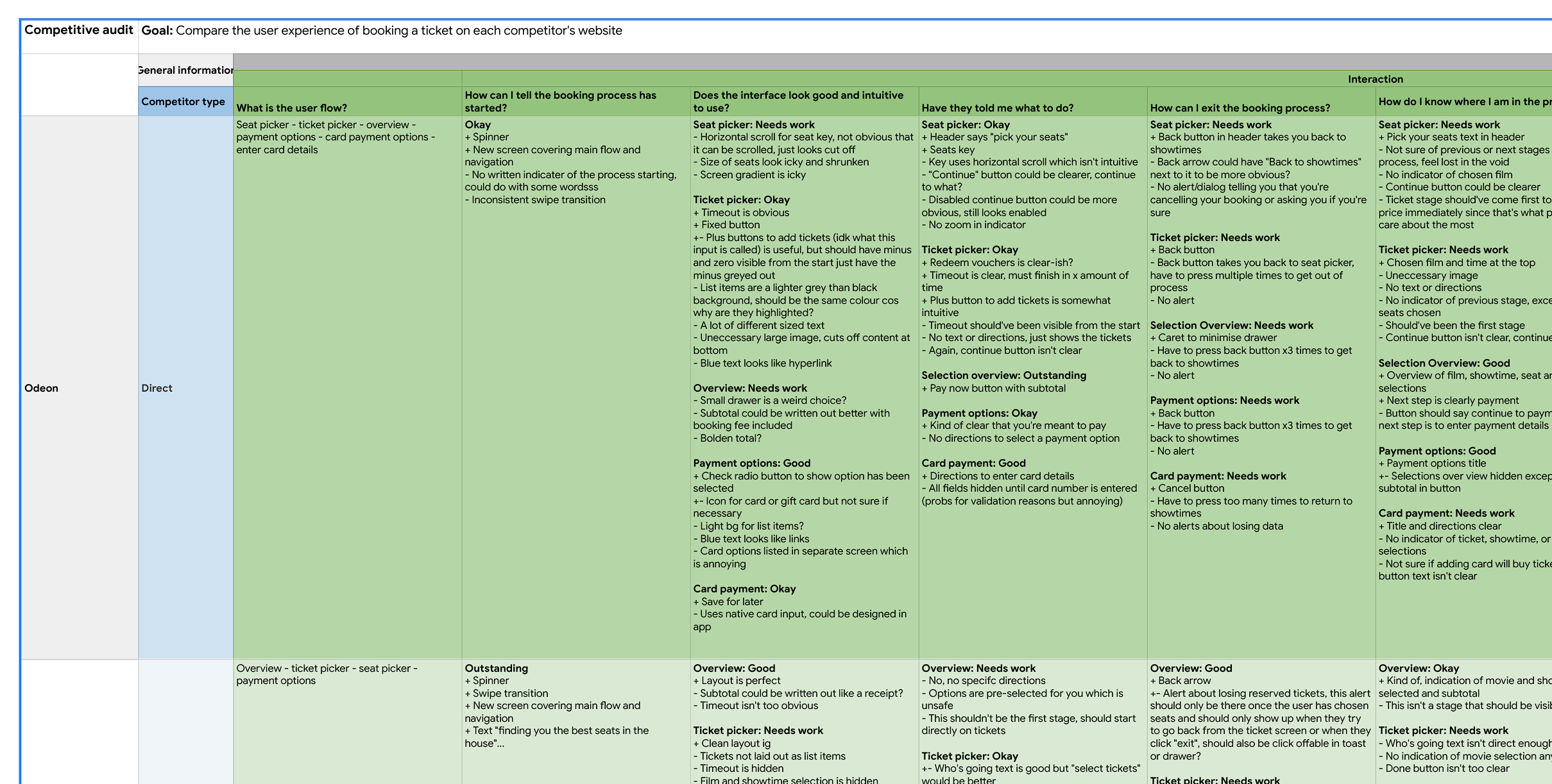
Additionally, I performed a competitive analysis of similar ticketing apps in the market to get a feel for existing solutions. I examined direct competitors (movie ticketing apps such as the Odeon mobile app) and indirect competitors (general ticketing/ordering apps such as Eventbrite and Uber Eats) to ensure I was looking at popular apps that are well-researched, and to see if I could find a standardised booking experience across the apps.
Once I gained an understanding of a standard booking experience, I created a user journey map to outline each step of the booking process.
Designing the app
I began drafting multiple paper wireframes for each step in the user's journey to test out different solutions.
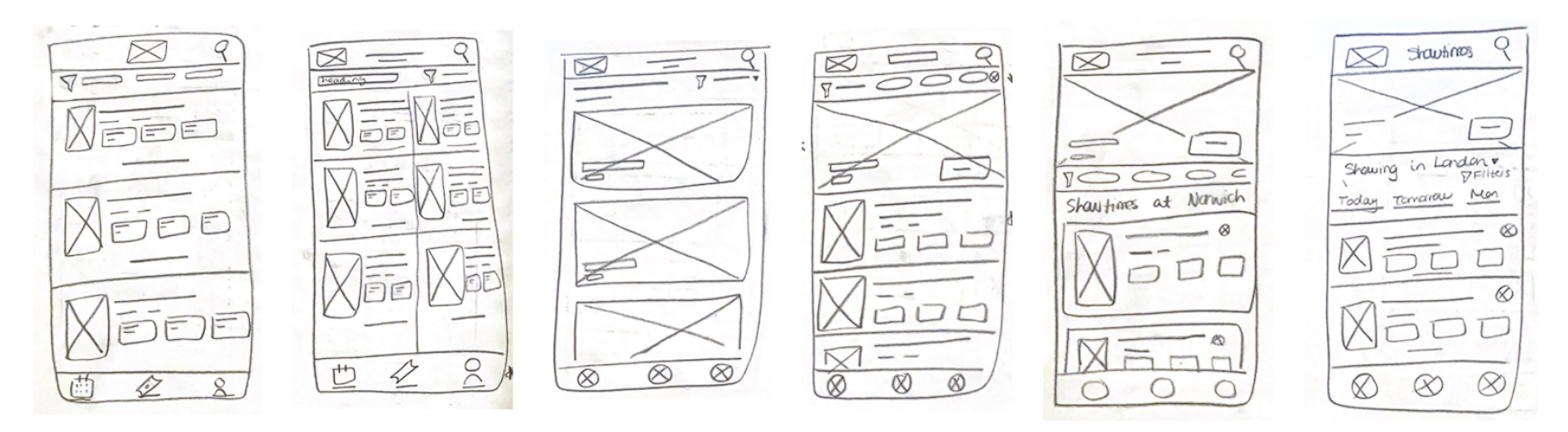
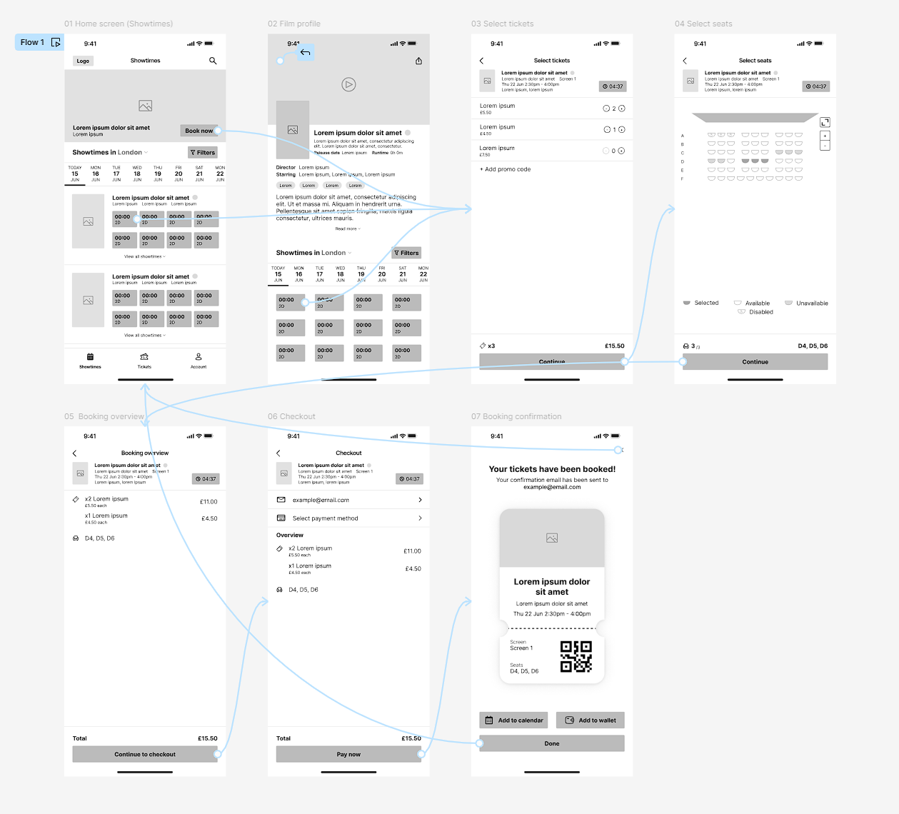
I narrowed each screen down to the most suitable solutions and gathered feedback from users on the layout each screen. I then created digital wireframes based on the feedback and then a low-fidelity prototype, displaying the primary user flow of the ticket booking process to be tested by users in a usability study.
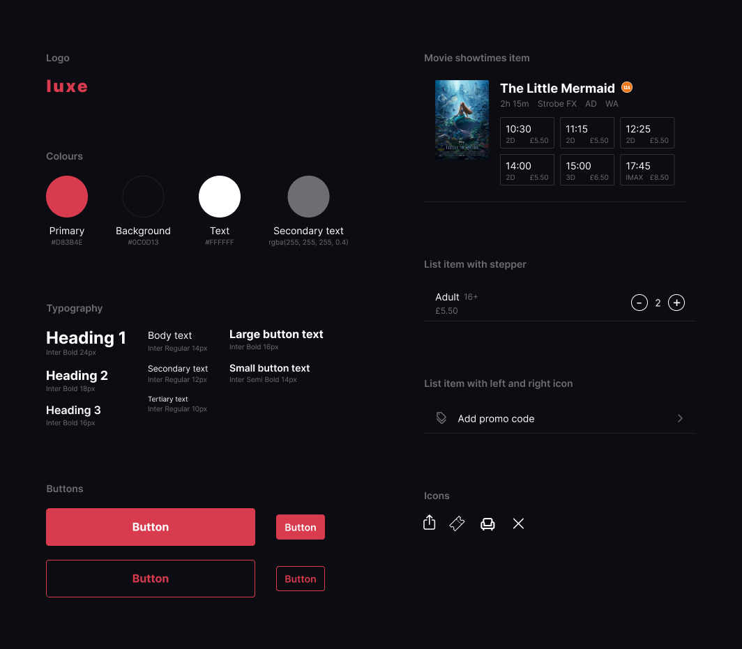
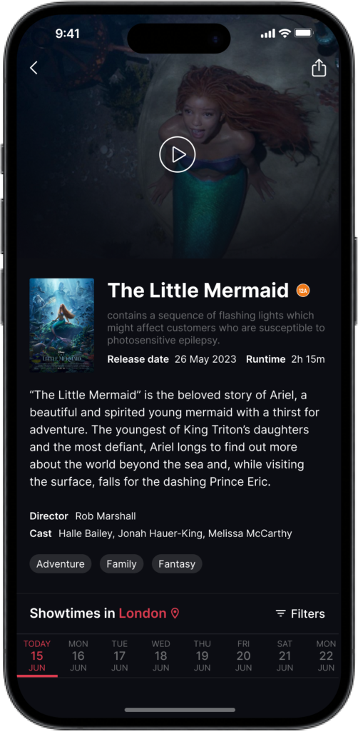
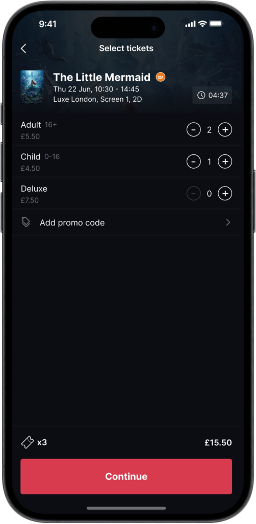
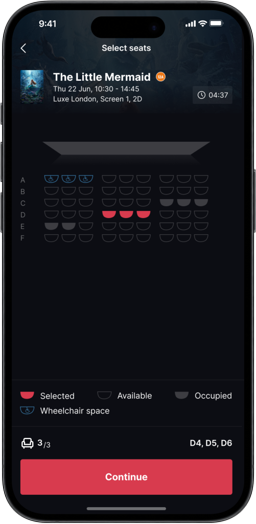
My favourite part of the project were the visual design side of things, adding colour, images, copy, and other visual elements to the design. I particularly enjoyed learning about the Gestalt principles and other ways to enhance the UI. I made sure to follow accessibility standards as well, keeping colour contrast high and text readable.
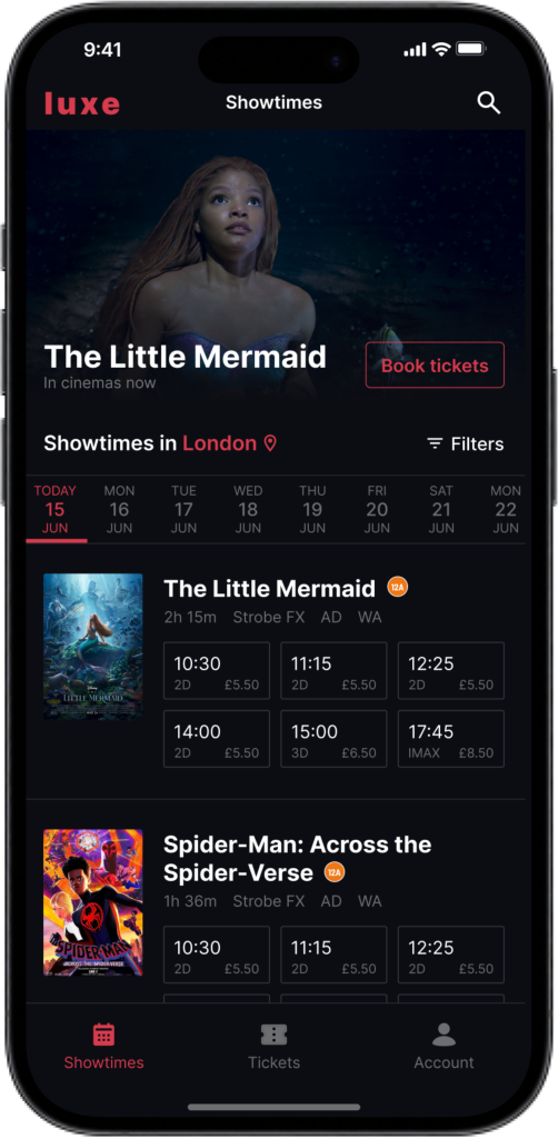
After many iterations of designing, testing with users, and revising, the final prototype was complete.
Takeaway
This course was a massive learning experience as it taught me to focus more on the problem rather than the solutions. Keeping the user at the forefront of the design ensured that I remained empathetic rather than methodical. This also meant that I didn't have rack my brain to figure out what the app needed, I had users to refer back to whenever a design decision needed clarification. I will definitely make sure to incorporate design thinking into future projects.
As for potential improvements, I would've loved to learn more about interaction design and include more motion and animation in the prototype. This definitely would've added more character to the design, making for a more engaging user experience.