A digital companion on your post-stroke journey
Role
Frontend Development, Wireframing, Logo Design
Tech stack
React Native, JavaScript, Expo
Tools
Figma, Visual Studio Code, GitHub
Duration
3 months
Links
Overview
During my scrum app development internship, my team and I chose a prompt to develop a mobile app prototype for users with post-stroke fatigue looking to improve their fatigue levels through physical activity. The app guides users through a 6-step Graded Exercise Therapy (GET) programme that prompts them to log their routine and associated fatigue levels, watch recommended exercise videos, and complete other fitness-related goals to boost physical strength.
The prompt
Our clients came up with the idea for PAST after co-authoring a GET self-help guide to encourage people with chronic fatigue syndrome to gradually increase their physical activity. They believed users would benefit from a mobile app to track their progress in the programme. Users could also show their logs to their healthcare providers to keep track of any changes to their health.
Scope
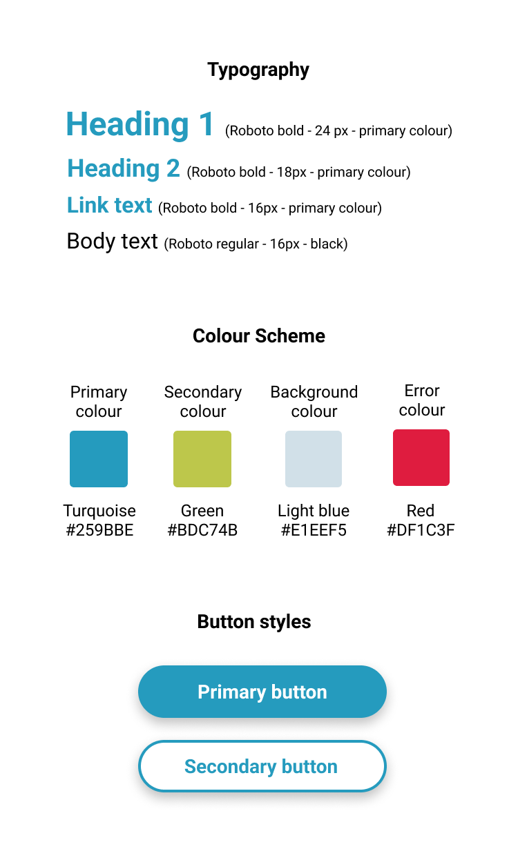
The aim of the internship was to build a working prototype by the end of a 12 week period using the scrum methodology. The scope did not include user research, so we reported back to our clients at the end of each sprint with a working product and received feedback from them instead. Eager to incorporate UI design into every project, I suggested that we create wireframes before coding, so we ended up structuring each sprint as follows: review backlog → design prototype → code feature → client feedback. I leaned into the main design role and created many of the wireframes, the app logo, icon, and colour scheme (inspired by the colours in the GET booklet). One of our team member's lead the backend development due to his experience in the field, while the rest of us shared the frontend responsibilities.
Brainstorming
We had an initial brainstorming session with our clients where we conceptualised user goals and crafted a typical user journey, landing on three big features to focus on. We decided that users would need to be able to: (1) follow the programme steps and associated daily tasks , (2) log their daily routine and fatigue levels, and (3) watch recommended exercise videos.
I recommended we add a competitive analysis to the backlog as I thought it'd be useful to see how our initial ideas compared to competitor products. I became responsible for completing this task and researched mostly indirect competitor health logging apps as it was difficult to find apps specifically for stroke survivors. The analysis helped to confirm some initial ideas for the UI, such as using a horizontal scroll on the homepage to list the user's daily tasks, which is a typical feature seen in similar apps.
Our solution
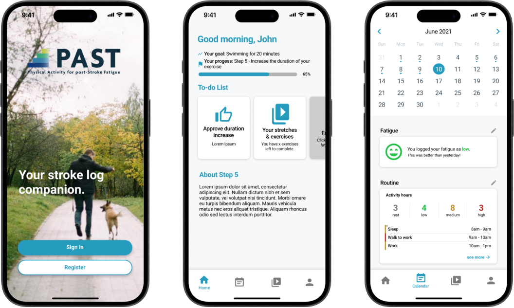
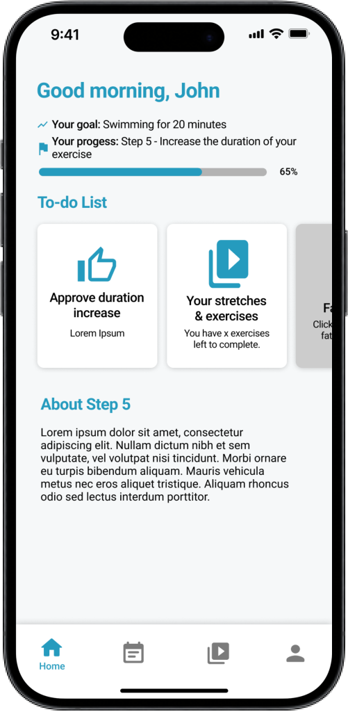
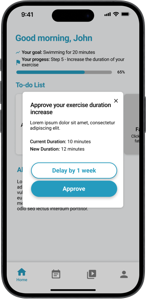
Home - Following the programme steps
We created a home screen that prompts the user to complete daily tasks associated with their current step while tracking their progress in the programme. Once the current step is complete, the user is then progressed to the next step with additional tasks added which could be either one-off or daily tasks depending on the step.
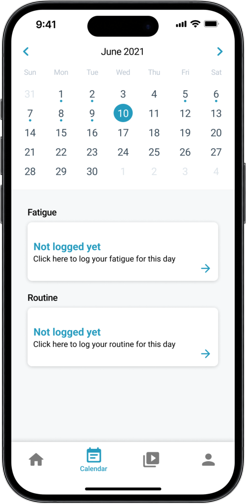
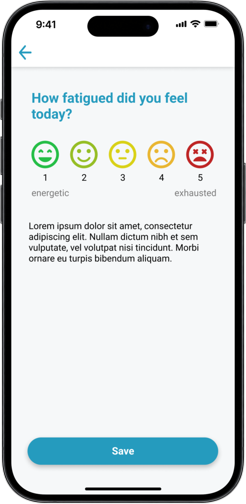
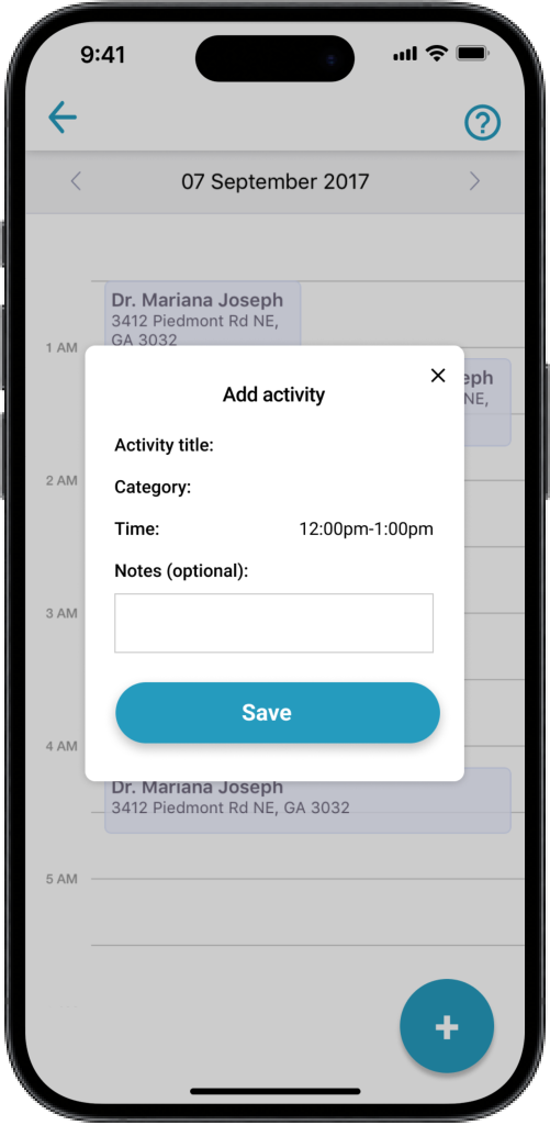
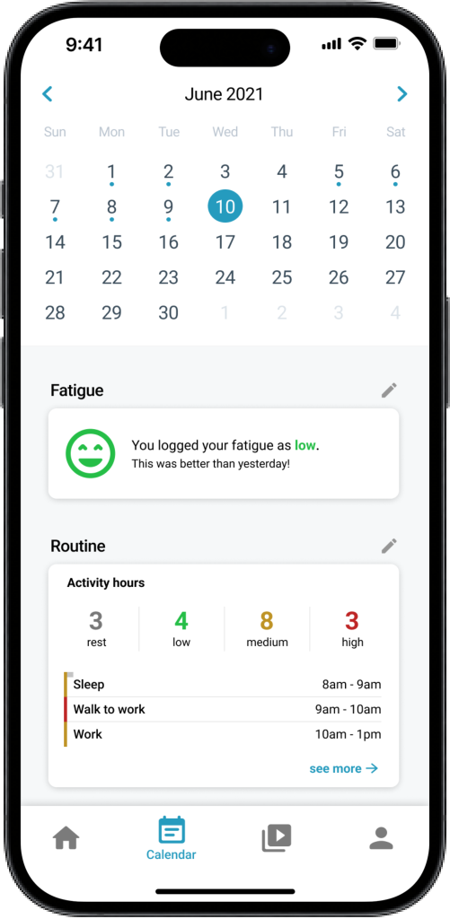
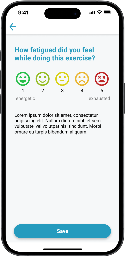
Calendar - Logging daily routine and fatigue levels
The app includes a calendar with a daily routine and fatigue tracker. Daily logging is also prompted by a card in the home screen's to-do list.
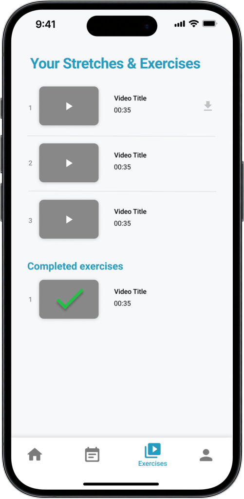
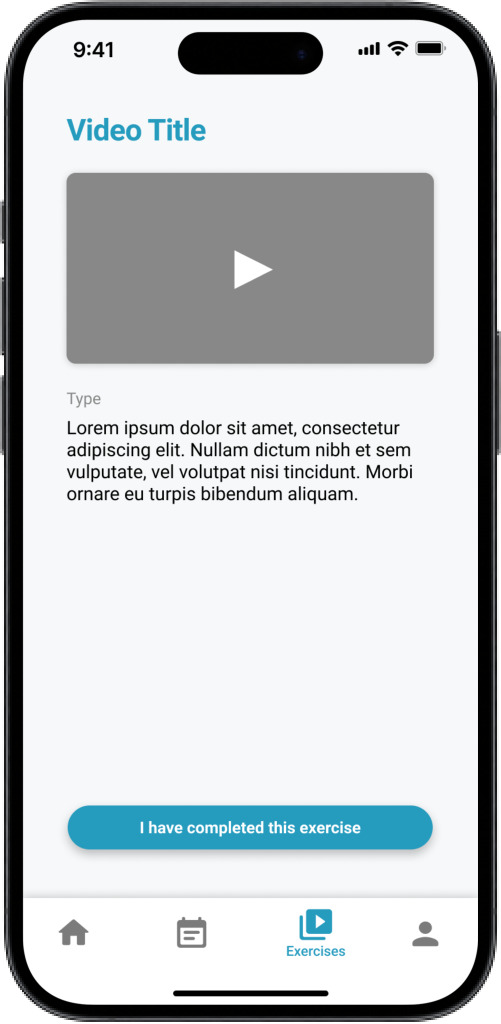
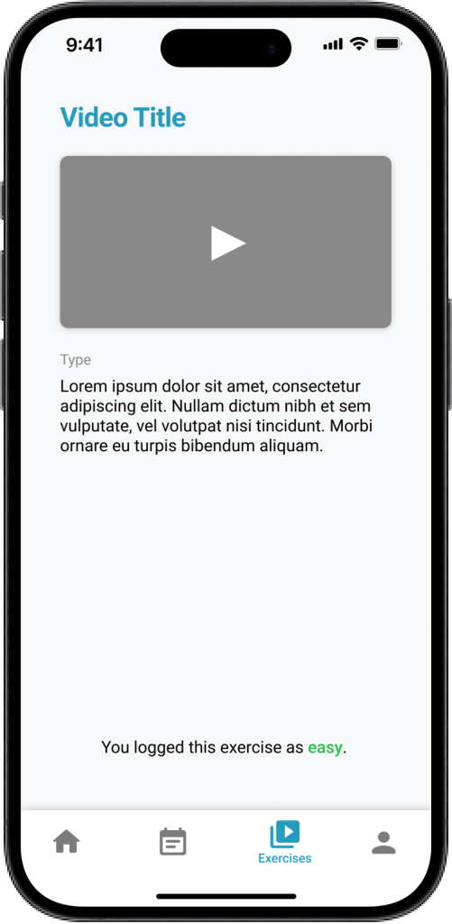
Exercises - Watching recommended exercise videos
We also created a video library of YouTube videos supplied by our client. The videos are unlocked in step 4 when the user is ready to complete daily exercise. Users are also prompted to complete these exercises daily by a card on the home screen.
Conclusion
The final prototype was handed over to our clients so we were unable to measure the success of the solution. It would've been nice to see the product to release and gain feedback from end users. I'm curious to know if consistent use of the app would solve our users problems and help them decrease fatigue levels and improve their fitness.
In general, I also think the app would've benefited from a user-centred approach. Doing user research to better understand their goals and pain points would've helped to avoid potential bias from our clients and us as developers. Due to the project's limited scope, we only had our clients to give us stakeholder feedback which was still helpful to have feedback at all instead of creating from solely a developer's perspective.