Stripped Sets
Logo design competition entry for an events management company
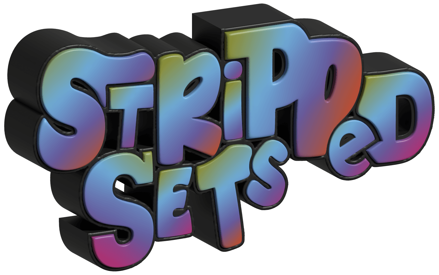
I designed a logo as part of a contest for Stripped Sets, an events management collective that promotes queer and POC performers in Norwich.
The main prompt was 90s nostalgia and vibrant colours, so I went for a tie-dye-esque gradient with a rubbery latex stroke to represent 90s queer club culture. I played around with combining different fonts, letter cases, and rotations, adjusting the baselines to give the text a fluid, alternative feel. I also tried out embossing and bevelling in Photoshop for the first time to make the logo stand out a bit more.
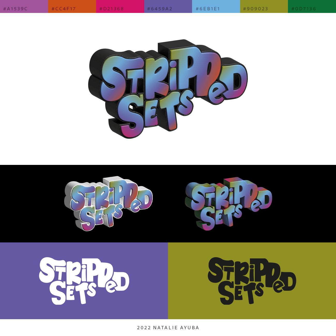
Though I didn't win, I did end up creating something that I'm really proud of.